Avertale
- Font
- Typography
- Type design
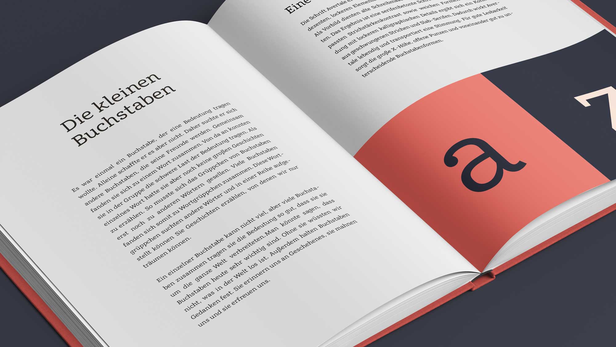
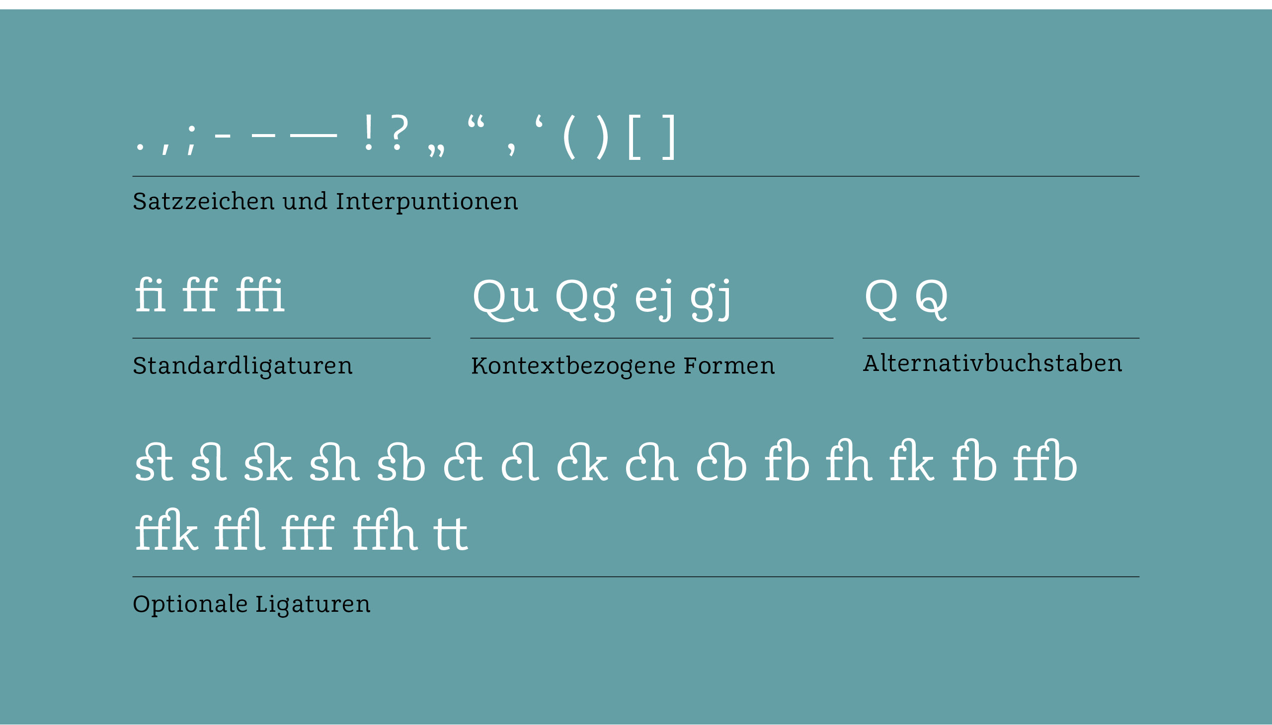
This project was part of a typography class during my studies at the Stuttgart Media University. The font Avertale resulted from the idea to combine decent informal curves from calligraphy with stylistic elements from old typewriter scripts. Therefore old typewritten texts were the first inspirations for some glyph characteristics. Due to the mechanic restrictions of old typewriter each letter of its typeface were accomodate on an equally large area (monospaced). Monospaced typefaces dealing with the problem of irregular margins between glyphs. The narrow letter 'i' shares the same fixed width as a much broader 'm'. So there is usually more space around a small letter and less space on the broad ones. The counteraction of this problem resulted in typical letter shapes. The letter 'i' got serifs to stretch horizontally. Thus it appears broader. The broad letter 'm' was compressed to appear smaller. Avertale subtly takes some of these stylistic elements of monospace letters. Hence Avertale's glyphs are very slighly approximated to the monospace letterforms. Broad letters are slighly smaller and small letter are slighly bigger.

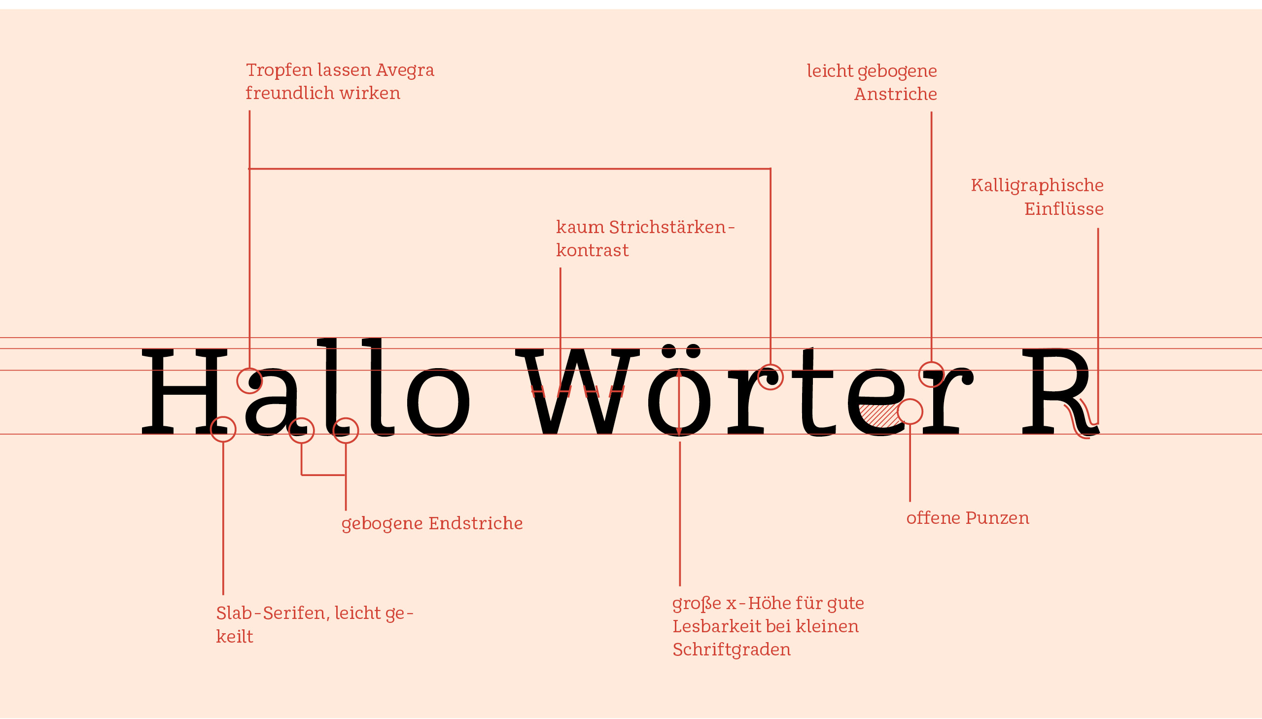
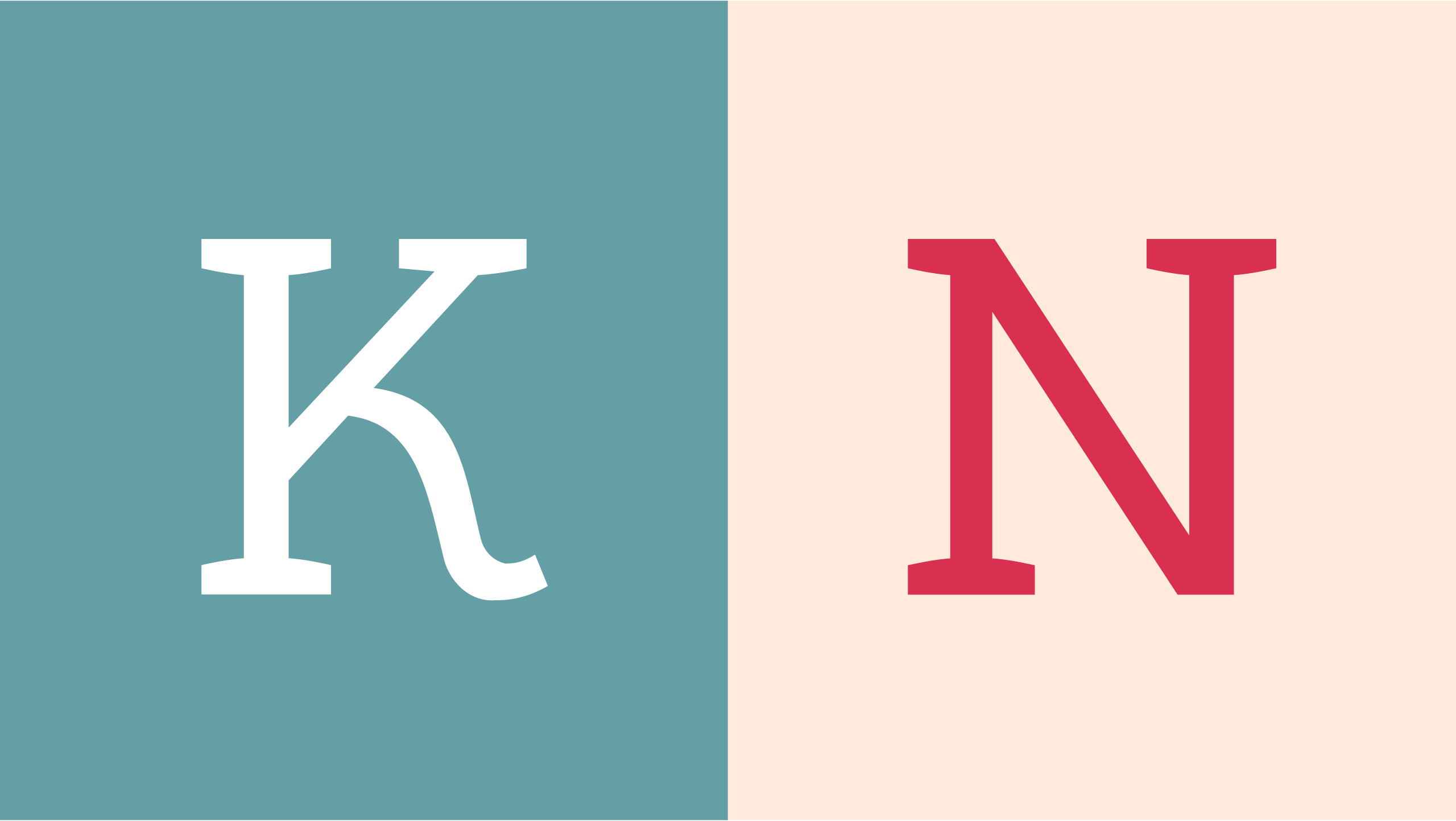
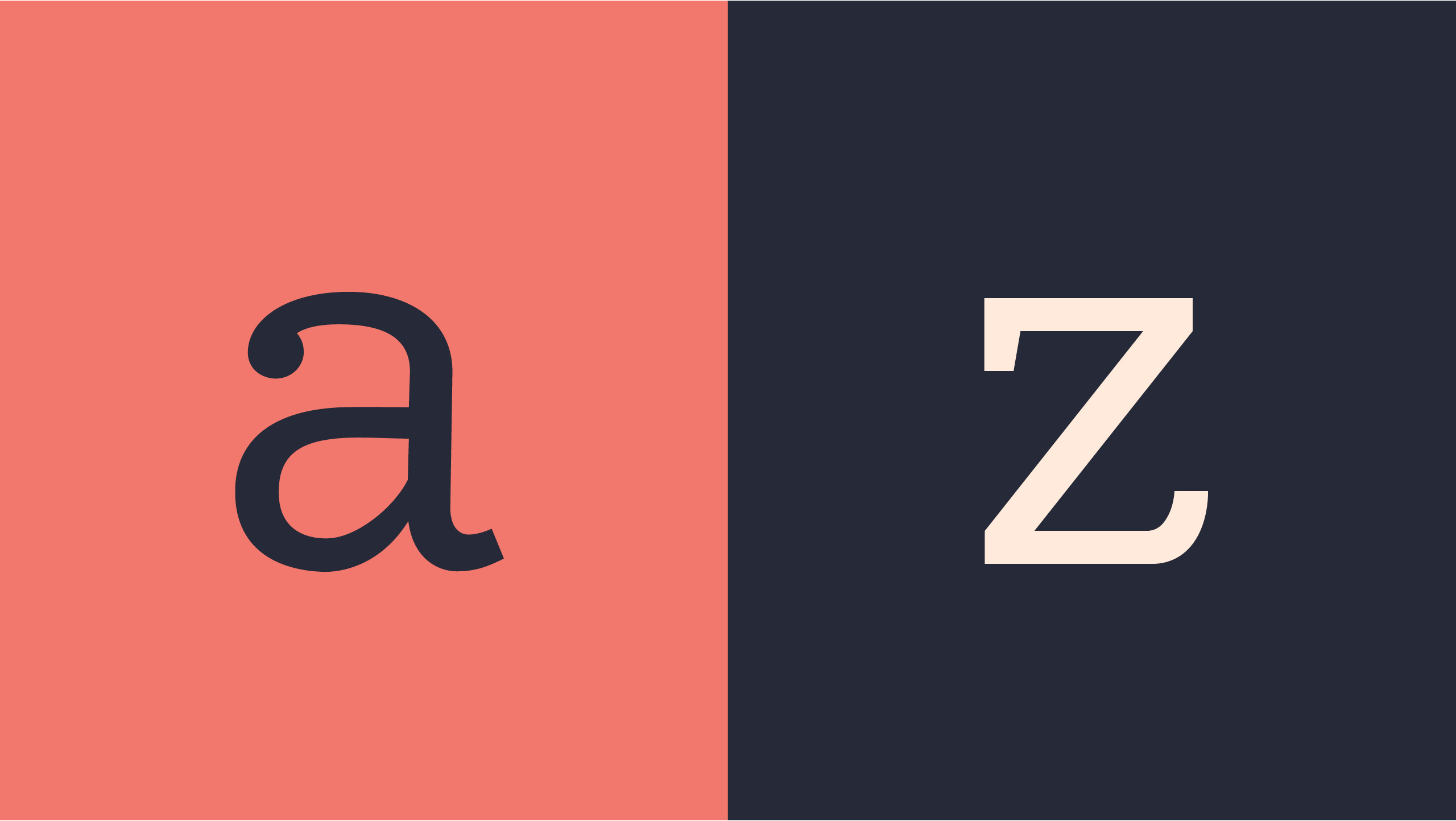
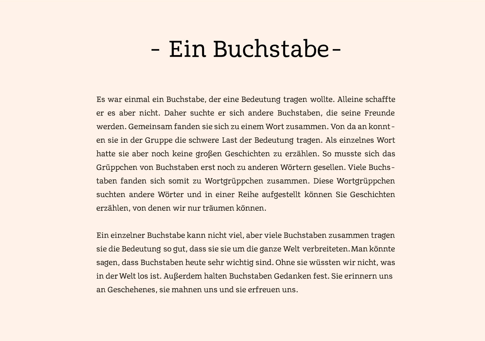
Handwritten scriptures were a good inspiration for informal characteristics. Avertale gets its curvy and somewhat curly look from there. Avertales letters have solid serifs and softly curved strokes. The final result is a serif typeface with only slighly contrast between upstrokes and downstrokes, as well as smooth shapes. With loose calligraphic details, there is a contrast between curved lines and slab serifs. As a result, Avertale looks vivid and transports a positive mood without too much distraction. Good legibility is ensured by the tall X-height, open counters and distinctive letter shapes.
